


LOGO DESIGN
LOGO DESIGN 01
PIECE OF CAKE
BAKERY
This is a logo design for the bakery name is ‘Piece of Cake’ . The main idea of this logo design is modern, line and the blue analogous colour. The main visual of this logo is a piece of cake created by line, that is match of the bakery name.
The main colour of this logo is around the blue, the background is in dark blue and the cake is in blue analogous, each line is in a bright colour, this will let the background and the cake be a contrast.


LOGO DESIGN 02

Kl urbanscape
music festival 2020
The logo is design for an event name ‘KL URBANSCAPE Music Festival 2020’. The main idea of me is I need try to combine the music and the urbanscape this two element in my logo.
The final outcome, the entire visual style of the logo has a combination of musical notes and urban skyscrapers to achieve the previous idea. The colour of it has purple and blue two version. This two colour can bring out the joyful and this element is suitable for festival.


Graphic Design
Graphic design 01
magazine design
Gamez
gaming magazine


Graphic design 02
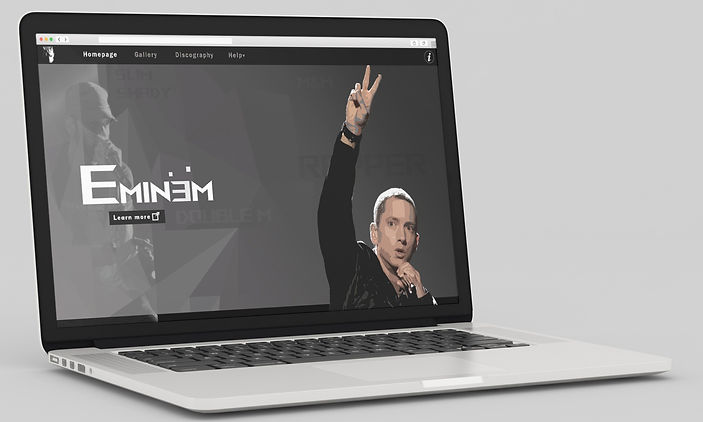
introduction website
eminem
web design


Graphic design 03
storybook design
journey of peter
This is a children's storybook with my own original story. The story focuses on Peter's journey as it happens. The book has a unique style of illustrations and short text to appeal to a child audience.


Graphic design 03

recipe book design
Nyonya Flavors
Asam laksa recipe
This is a recipe book to teach how to cook nyonya flavor asam laska. In terms of design, I am trying to make it as simple and clear as possible. For the color scheme I have used yellow plus purple.


illustration
illustration 01
the Fear of
aquaphobia


illustration 02
action
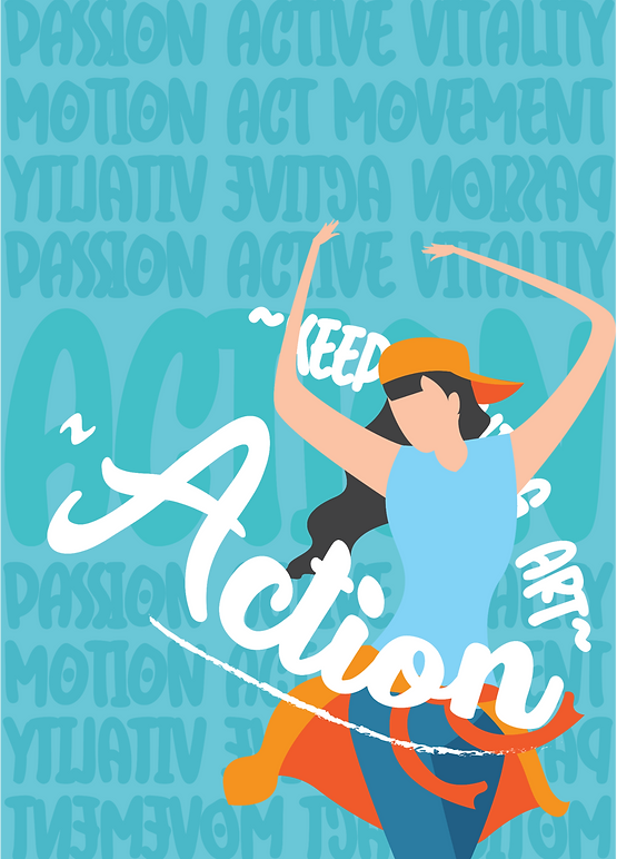

illustration 03
SIDE

Concept
On the social media, I often see many people looking at things without understanding the whole picture or without considering the positions of both sides, so they are always in a hurry to make a conclusion, so there are often arguments.
What I'm doing
In this project, I will going to a Digital Story.
( The story will be told from the viewpoints of two different characters, so that the audience can have two viewpoints and see the story from two different viewpoints, and have a different perspective than if they had only seen one story. )


Contact

thank you!
contact no: 010-377-3038
Email: tingdeqin97@gmail.com
My goal
My goal is to use this story to make people more willing to understand the whole picture and to think about or understand different positions.